24 April 2019 – United Airlines unveiled its brand-new livery today in Chicago. It’s United’s first new paint scheme since the company merged with Continental Airlines in 2010.
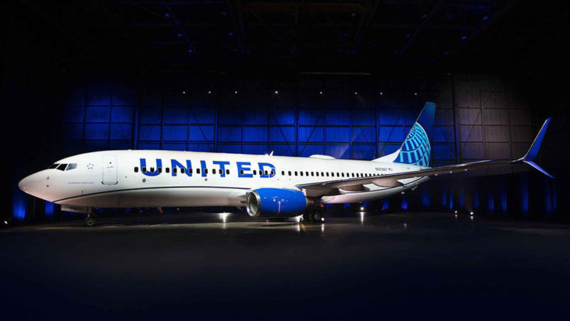
“As we improve and elevate our customer experience, we are changing the way people think and feel about United, and this branding captures that new spirit,” United Airlines CEO Oscar Munoz said in a statement.
“This modernized design, especially our iconic globe, enhances the very best of United’s image and values while pointing in the direction of where we intend to go next in serving our customers.”
The current United livery is based on Continental’s old blue and gray paint scheme, complete with a blue and gold globe on the tail. That design has been around for nearly three decades.
United’s new livery is more evolutionary than revolutionary. It’s actually the next iteration of the current paint scheme.
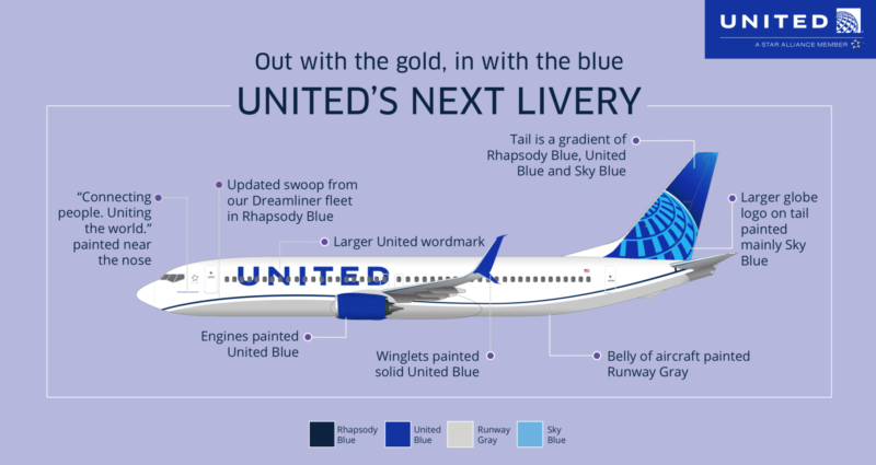
Rhapsody in New: Proud of our past, even more excited to serve you in the future. https://t.co/tRC5UPIC7Q pic.twitter.com/b4z9yiWZ1g
— United Airlines (@united) April 24, 2019
The biggest change will the more prominently displayed “UNITED” wordmark along the side of the plane. The globe on the tail has been redesigned to feature three different shades for blue — rhapsody blue, United blue, and sky blue.
My initial reactions are generally positive. I love that they have kept a wave cheat line and the grey belly. The tail and the engine cowlings look fantastic. It is far from creative or revolutionary but I guess the globe represents United well since the merger. Let’s give it some time to see some of wide body in United fleet looks like in this updated livery. To me, personally I think this “updated and evolved” livery brings a more contemporary look over the gold cheatline.

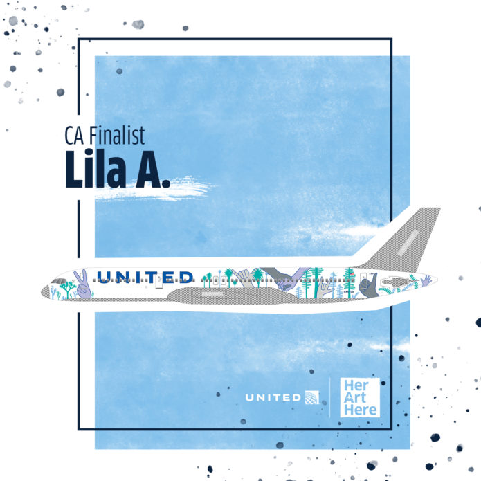
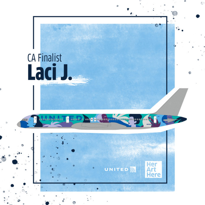
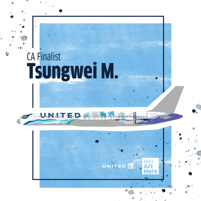
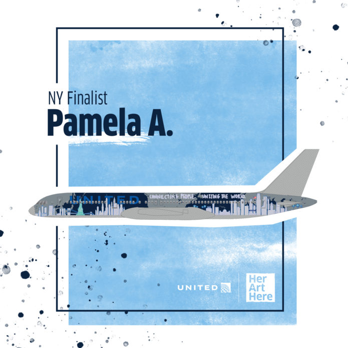
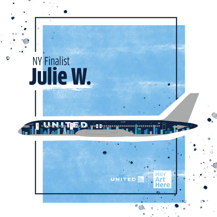
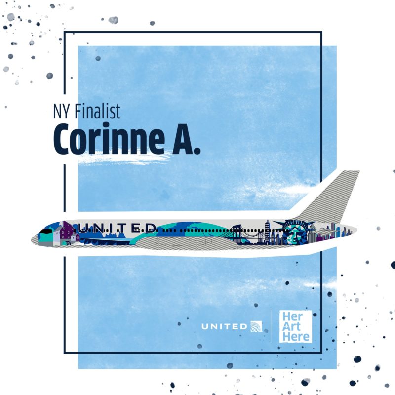
Speaking of livery, United finished up voting for the Her Art Here project and can’t wait to see one of these new liveries flying soon. (Go Corinne A. + Laci J.)


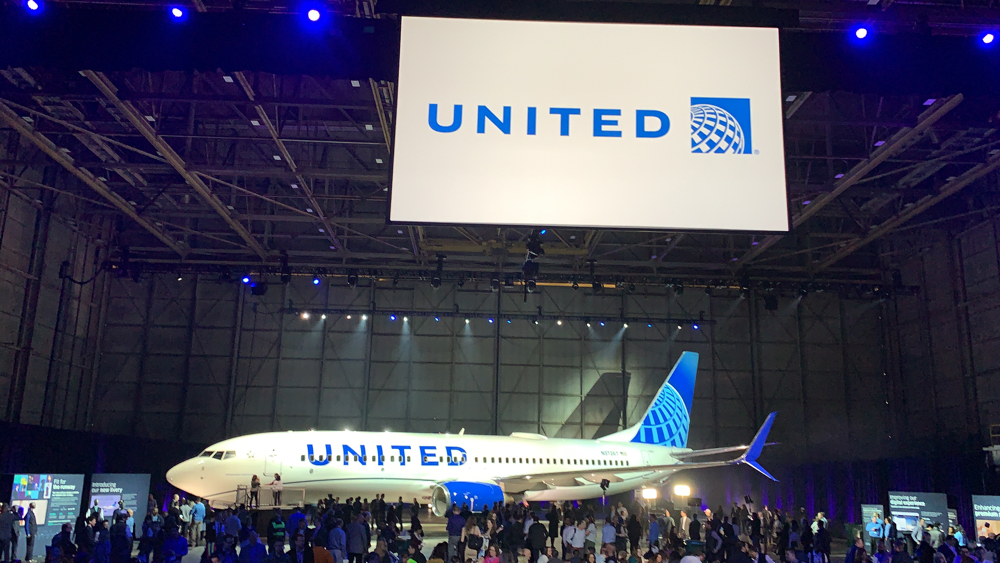


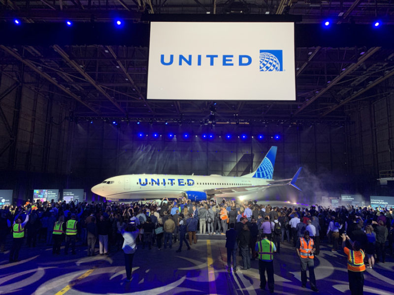
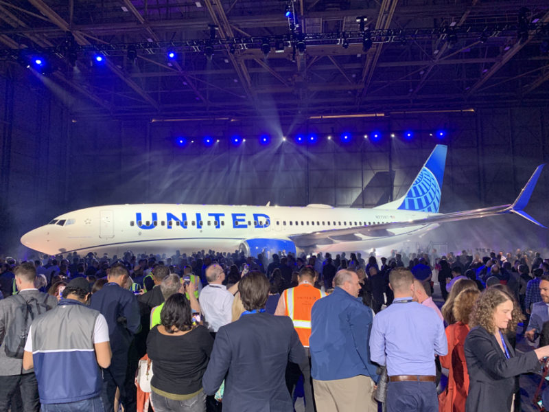






The new livery seems to lower the classy, dominant, and power of the large united airlines company. Seems a little “relaxish” rather than “solid.” United has honored the Continental globe long enough… it’s time to return to the large United tulips on the tail and give their aircraft a strong livery. The tulips said so much amount the airlines–both figuratively and concretely. American Airlines completely flubbed their re-livery… United should not do the same. (Personally, the livery I liked the best was used the shortest amount of time–the dark blue on the bottom and 3 stripes just below the window line getting lighter to a white top. I believe it’s called the “blue tulip” livery.) Cheers, everyone!
I think it is classy, clean and professional. It is a million times better than the awful livery American Airlines introduced a few years ago. I know not everyone is happy and that it’s not a revolution, but I think it is the right thing for United as a company, their employees, and their customers. Well done, United.
what does a dead tulip have to do with the company trying to be a global airline? the tulip was on old united airplanes until the paint fell off – I guess that’s what you want.
to me the tulip represents crap customer service, bankruptcies and cancelled flights – everything I used to be too familiar with.
However, the Continental globe still used was “dead” (Continental failed) long before United did.
Super dull. Nothing distinctive. Just bigger letters. Blah. What a bummer that’s the best they could do.
Hate it. The window block outs look horrible in the billboard title. Its just Continental again.
and that’s a good thing – the tulip is DEAD, long live the globe!
It costs a serious amount of money to change logos and not just in airplane paint, but brand and marketing. This is a great update to an old worn out color scheme and one that keeps investors and the bottom line in mind- good choice!
My expectations have not been met at all. I agree with you Sam Chui. The bold United looks out of place. One theory is that they left it that way so they didn’t have to change all their signs.
yeah, please bring back the tulip. lose the Continental globe. it was alway generic and not a good brand which is why they are called United these days.
the tulip is DEAD, long live the globe!
WTF does a tulip have to do with being a global airline?
I don’t understand how or why a professional graphic design company specializing in corporate branding could squander a wonderful opportunity to professionally brand one of the world’s largest and most visible companies. The globe is the same as the current image and is not a representation or an evolution of the updated globe used in most of United’s newer advertising. The beautiful shades of blue and deep purple promised are or appear to be absent. I am hoping this is another false ‘leak’ and, as a commercial aviation and branding enthusiast, I will awake in the morning to a fresh and subtle yet striking, professional new United Airlines livery.
I find it interesting that the the Business class product has a stronger identity than the corporation to which it belongs. It baffles me that they continue to use the logo of a company that no longer exists. As for the livery itself, I place it on par with Delta. It’s okay- inoffensive and uninspired…perfectly “corporate”.
Frontier, Southwest, American, the last Pan Am livery all have/had billboard fuselages, this is unnecessarily boring and unoriginal.
Glad they kept the Continental tail. On the other hand, the wave reminds me of the tacky smile painted on the front of old PSA planes.
Generic and dull – just like the current United (really Continental). I miss the old tulip designs.
the tulip is dead! Good riddence!